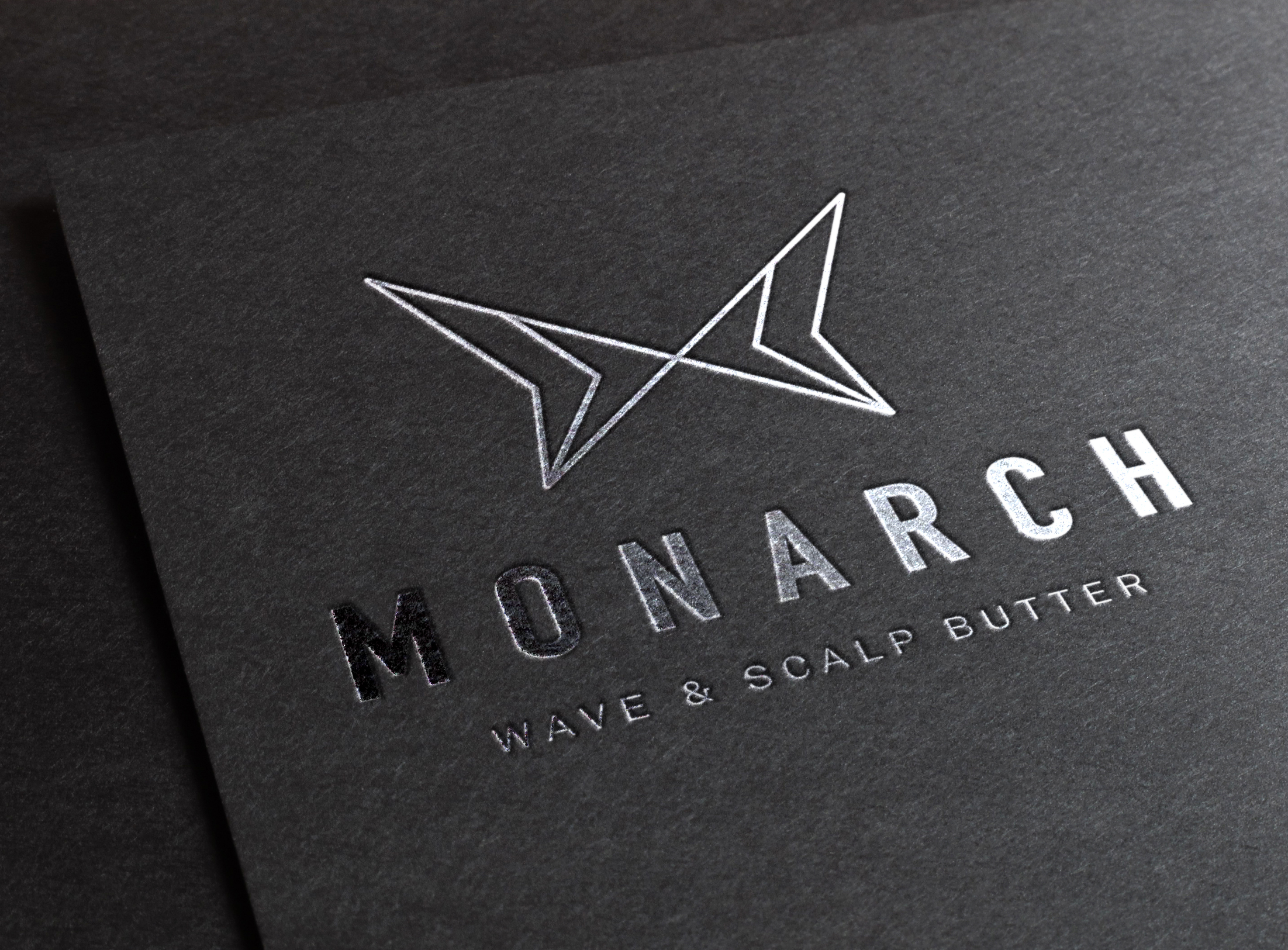
To help define and create texture for different types of hair, Monarch offers organic wave and scalp butter products. Surcreative designed the company’s logo and packaging for its product line, creating a visual identity to reflect and embody the products’ natural ingredients combined with the company’s lovely, transformative name.
With an opportunity to define a natural brand identity to help sell its product line, surcreative developed a modern yet minimalistic logo that made the brand both approachable and down-to-earth. The angular yet linear logo embraces the company name with a delicate butterfly.
For the company’s name, the bold font and dramatic spacing between each letter (“tracking”) represents the dark lines and white dots on the wings of a monarch butterfly, conveying flight and natural identity. The black and white color palette combined with a modern packaging design ensures that these products will stand out on shelves everywhere!
“surcreative helped make my vision a reality”


